OUR MOODY BAR REVEAL!
Well this bar turned out to be two things, moody and modern. We definitely transformed this space in our home into a little jewel box *pinch me*, oh and it’s also amazing for hosting a cocktail hour!
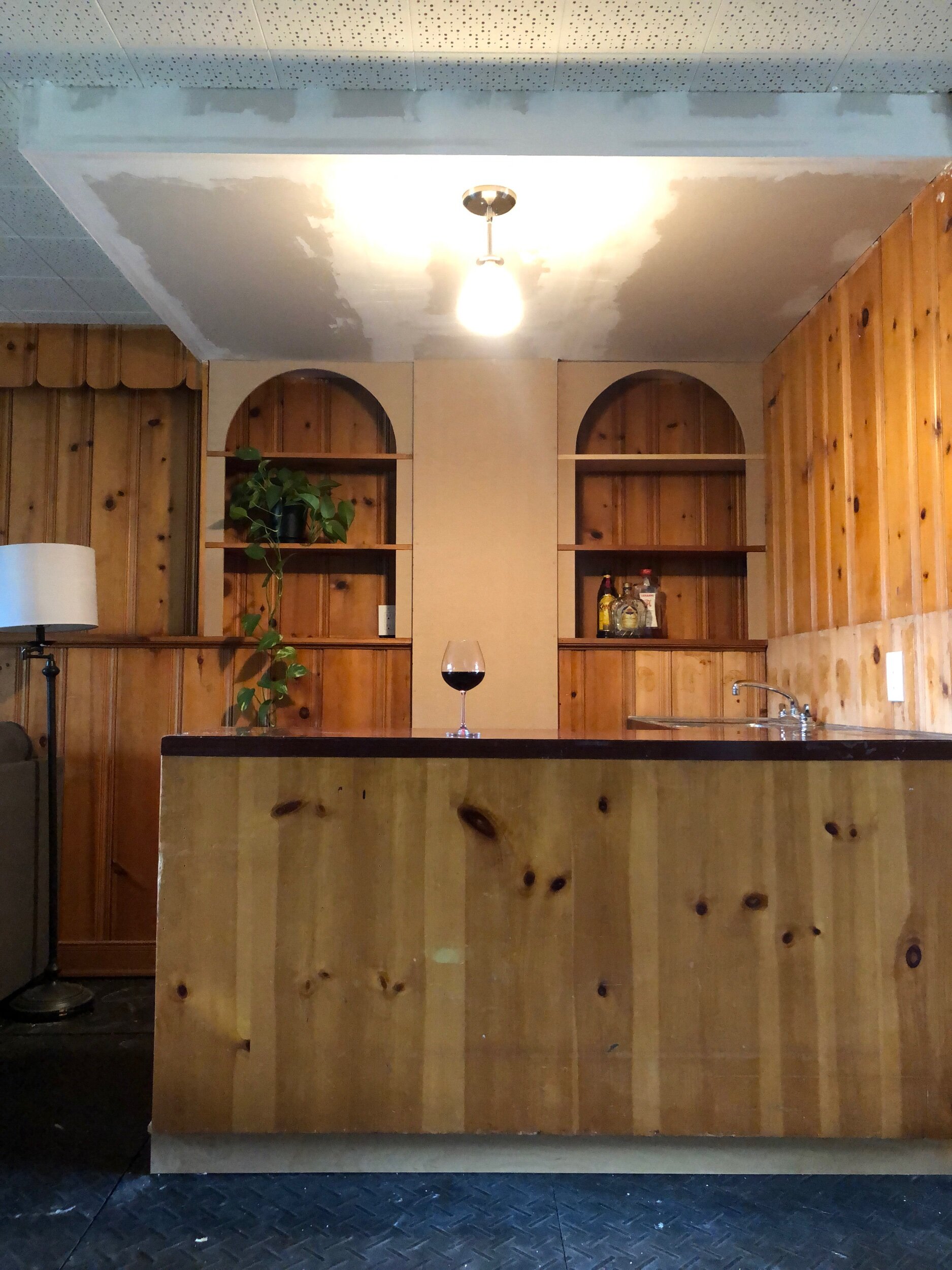
Just for a recap, here’s a before photo from four months ago (sorry real talk, renovating while working full time is a slow, slow process)…
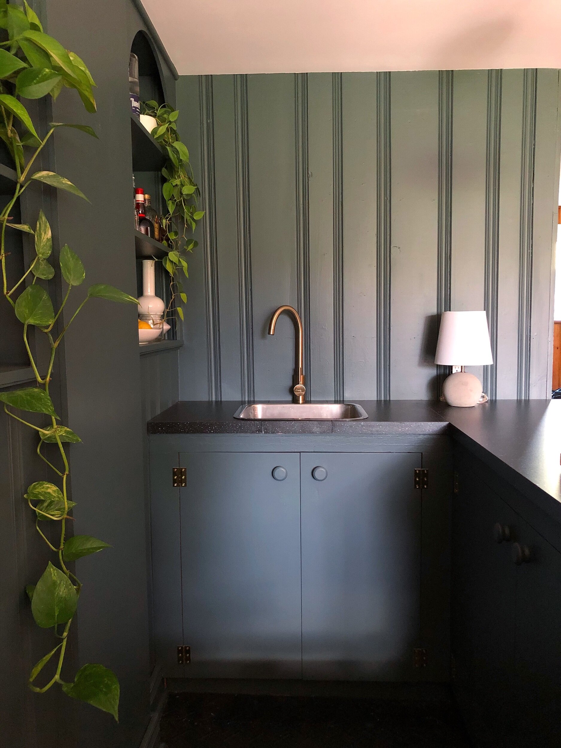
And here we are today…
Talk about an improvement!!
Throughout this process we definitely did everything we could to reuse whatever materials we had on hand. We left the shelves on the left of the stack intact, and shortened the shelves on the right side to match. Symmetry was definitely a goal with this renovation, we wanted it to look intentional and not like the previous afterthought it was. We moved the light fixture to the centre of the ceiling and added some framing to support the ceiling drywall.
To finish the centre portion in between the shelves and to frame out the arches we used a piece of MDF. It’s the perfect easy to use material that provided a nice clean surface for the paint. The arches were a small and simple detail that I really wanted to include in this space, it truly provided so much elegance to the shelves.
For the lower level in our home, I had always envisioned a dark moody space. But for some reason whenever we get mid project and things are the messiest and look the worst, I always doubt my original vision. It seems like this has just become a part of my process. With this renovation, I was questioning the paint colour (should I just paint everything white?), the countertops, the arches, every. single. detail. But sometimes you just need to follow your original plan, adjust within reason, trust your gut and the results will speak for themselves.
We then painted every wall and the ceiling with two coats of primer. This is such an essential step to make sure the paint sticks to the wood panelling and it also really helped to make the dark pewter paint application seamless.
And then we painted and painted and painted some more, and then installed our fixtures and overcame a countertop that was too short (check out instagram story highlight if you don’t know what I’m talking about) then BAM we had a finished space bar.
I’m very proud that the only new material we brought to this space was 2 sheets of drywall, a sheet of MDF, a countertop, faucet, light fixture and some cabinet hardware. We really were able to make the most of what we had in this space and I’m incredibly happy with that! We only spent about roughly $300 on this renovation (can you even believe that…!) and one day we will tackle those hockey arena floors but for now I’m happy hosting, gathering and ADMIRING this space that we built and CHEERS to that!
(also for those wondering, Joel’s saw didn’t make the cut, sorry not sorry my love)
Sources:
Paint colour - Benjamin Moore Dark Pewter
Countertop
Faucet
Pendant light
Lamp - Home Sense
Rug
Print
Knobs
Hinges


